
The Graph
The dataset used for this project has been made from scratch, by searching all the required information from my collection of Purple-related books, album liner-notes, fanzines and specialized websites. This CSV file includes (to this day) 10924 rows, distributed across 5 columns. Each column indicates the source, the target, the type of a specific associated act (Band, Album, Event, etc.), the universe and the density of each node respectively. The nodes represent the involved artists (written in lowercase characters) and their associated acts (typed in uppercase), while the links show their reciprocal interactions. The size of a single node is based on the number of collaborations of the corresponding musician, while the thickness of its links represent the weight of the potential relationship between the selected artist and a member of Deep Purple. Since the dataset is costanlty updated, the density used for measuring the activity of a node, is computed by calling the
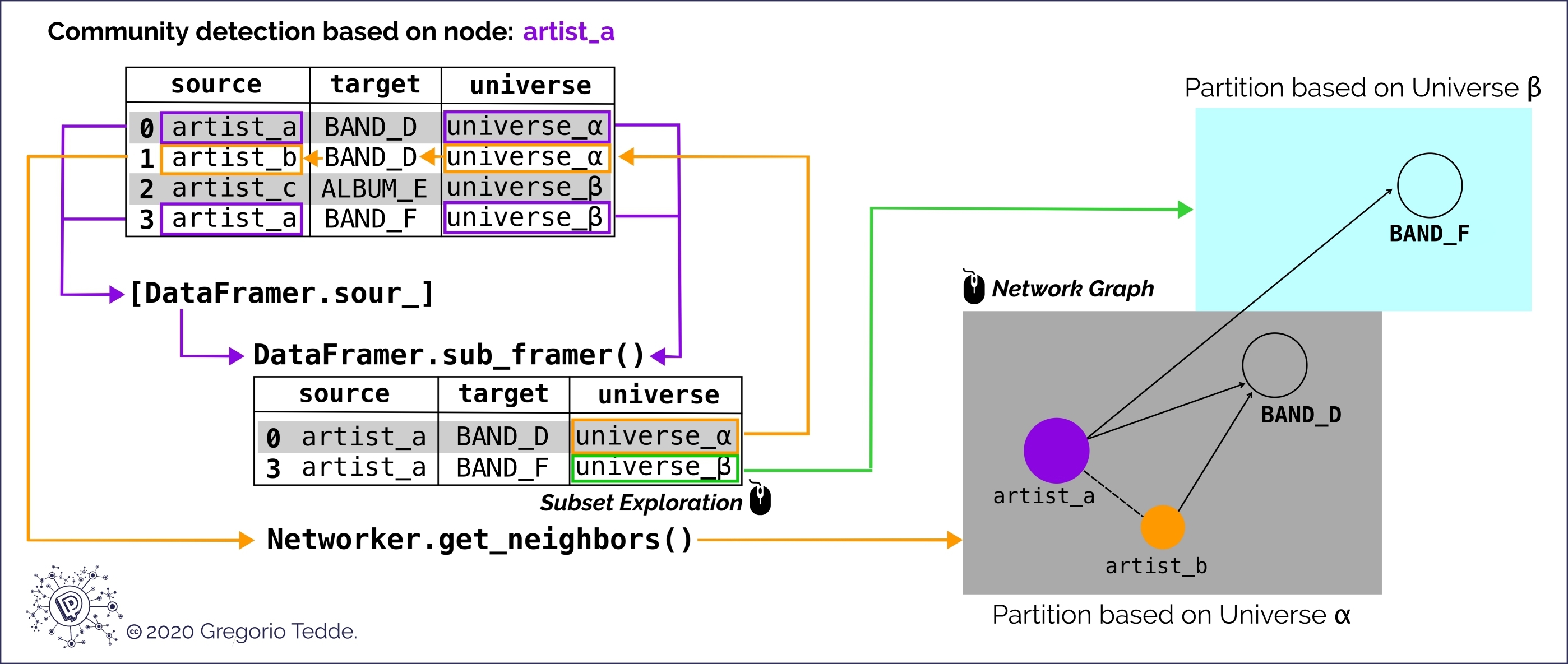 Filtering the original data frame and detecting network communities with DataFramer and Networker custom classes.
Therefore, each universe acts as a sort of default clustering partition, which lets the user able to explore the graph by looking at a specific archetype of nodes community, detected for the single artist, whose name is entered as a query by the user itself. This kind of data visualization has been developed in order to let the user be able to navigate inside the network without having to iterate through all the edges of the original graph - it would be really hard to load it, given its size - and extracting the relevant parts of the network for each desired artist. When selecting a specific artists from which to generate the related graph, all the neighbors are chosen according to the most appropriate targets and universe that are in common with the selected name. For example, when choosing
weight_sources() method, inside the DataFramer class of the graph_bouncer.py module. The majority of the bands are distinguished by the different line-ups that occurred over the years (e.g. DEEP PURPLE #1, WHITESNAKE #3, BLACK SABBATH #1, etc.), hence the universe tag denotes the main group to which each formation belongs. Hence, for example, the targets DEEP PURPLE #2 and DEEP PURPLE #3 have been included under the Deep Purple universe, while WHITESNAKE #3 and WHITESNAKE #4 have been merged into the Whitesnake universe even if many of their members were in common. This matching pattern is the main idea on which the DataFramer class is based (see the figure below).
Filtering the original data frame and detecting network communities with DataFramer and Networker custom classes.Therefore, each universe acts as a sort of default clustering partition, which lets the user able to explore the graph by looking at a specific archetype of nodes community, detected for the single artist, whose name is entered as a query by the user itself. This kind of data visualization has been developed in order to let the user be able to navigate inside the network without having to iterate through all the edges of the original graph - it would be really hard to load it, given its size - and extracting the relevant parts of the network for each desired artist. When selecting a specific artists from which to generate the related graph, all the neighbors are chosen according to the most appropriate targets and universe that are in common with the selected name. For example, when choosing
Ritchie Blackmore, Don Airey will appear as his neighbor since they have been both in Deep Purple (even if in different formations); but, when selecting Glenn Tipton, Don Airey will appear as a member of the Judas Priest universe - given his many collaborations with the band and with Glenn Tipton himself - and not as a Deep Purple member. Moving accross the original network, the most remote nodes represent musicians that can be considered marginal in the context of this analysis. Therefore, when choosing one of them from the dropdown menu, this would be included in a very small universe, which, at first, could seem not so relevant in the Purple family context, but its neighbors surely are. For example, when plotting Alex Machacek's graph, no members of Deep Purple are shown, but his neighbors Eddie Jobson and Marco Minnemann collaborated with Roger Glover and Joe Satriani amongst others, so their relationship with a Deep Purple member is interpreted as the path that passes through all the involved nodes (see figure below). In order to avoid graph over-fitting, the numerous solo albums line-ups have been taken into account only if they were particularly determinant in finding stable connections between the involved musicians.
 Paths between a marginal node and two Deep Purple members. Deep Purple Mk6 is a connected component inside the original graph.
Start Exploring
Click on a Binder badge below, depending on your device.
After landing on a new page, start exploring the DP family graph!
💻 Desktop Visualization:
![]()
📱 Mobile Visualization:
![]()

(CC) 2020 Made by Gregorio Tedde just for analysis purpose.
This work is licensed under a Creative Commons Attribution-NonCommercial-NoDerivatives 4.0 International License.